Good UI Examples
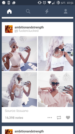
1. Tumblr Dashboard (mobile app)
1. Tumblr Dashboard (mobile app)
- The Tumblr dashboard on the mobile device I think is an example of a good UI design. The purpose the interface is to allow users to scroll through their "dashboard" and look at posts that were posted by other users that they follow. To look through the dashboard, all the user has to do is scroll up or down with their finger and they see one post at a time. Also the background is a dark blue color and each post is nicely separated by their own white box so you can differentiate one post from another. The top left corner of each post shows you which user posted that specific post and the bottom right corner shows 3 icons to like (heart) , repost (cycle), and share the post (ellipsis). This is all a very simplistic design and is kept consistent throughout every post. The 3 icons are also very simple metaphors that are easy for users to understand their meaning and purpose. There is also a toolbar on the top of the dashboard with 4 icons that take you away from the users dashboard to other parts of Tumblr. There are no words associated with these icons, but it also adds to the simplistic design of the overall interface. Overall I think this is a good UI design because it is a simple and clean design where users can quickly and easily achieve their purpose of viewing their dash.
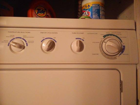
2. Drying Machine
- I think the drying machine in my apartment is another example of good UI design. There are 4 knobs on the dryer and the purpose of this interface is to select the desired settings so the machine can correctly dry the users clothes. Each of the 4 knobs are properly labeled on top to inform the user of what the specific function of that knob is for. This is a good example of consistency. Only knobs are used for the input method of this machine. Also, knobs afford turning, so it is easy for users to understand that in order to use the machine, all you need to do is to turn the knobs. The big knob on the far right has 3 different colors to separate the settings of "Timed Dry", "Air Fluff", and and green area. They are colored because within those colored settings contains more descriptive information about the setting. The gray area of "Timed Dry" and blue area of "Air Fluff" is separated into length of time. The green area is not labeled, which I think is one flaw of the design, however, it is still easy to understand the settings in the green area. It's probably not labeled because the settings in this section are not easily grouped into one category- they're all quite different. But in general, these knobs create great visibility. They give users enough information to know exactly what settings they can turn the knob to without overwhelming them with too much information. There is also a separate knob clearly labeled "Turn to Start" for the user to use once the desired settings are selected. Having this knob separate helps to prevent errors. Users can double check that all they have selected the desired settings before turning the drying machine on. Once the "Turn to Start" knob is turned to on, the drying machine will make a noise and start running and this is great feedback for the user to know that the machine has clearly turned on like they expected it to.
Bad UI Examples
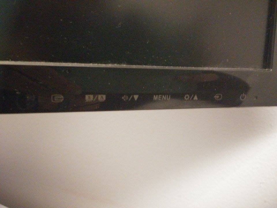
1. TV setting buttons
1. TV setting buttons
- I have a TV in my room with buttons on the bottom right corner that I think is an example of a bad UI example. The buttons are labeled with icons and they are not obvious to understand what the icons mean. The purpose of these icons are to inform users of what the buttons on the TV do in order to change the TV settings. The only icons that are easy to understand metaphors are the Power button on the far right, the sound icon, brightness icon, and the up and down arrows. The Menu button is labeled in English so it is not consistent with the icon design. When I first look at the buttons, I see a down arrow next to the Sound icon and an Up arrow next to the brightness icon. My first thought is that I can only turn sound down and brightness up? This is a visibility issue because it is not obvious what this means. It's not until I play around with the buttons that I learn that it is set up like this because the Sound button also doubles as a Down button and the Brightness button doubles as an Up button. This may confuse many users. Each button should have their own separate function, but I think it may have been designed like this because they didn't want to put 2 additional buttons on the TV. I think it is okay to keep the buttons they way it is, it just may make learning a bit more difficult since it is not obvious at first what having the icons next to each other like that mean.
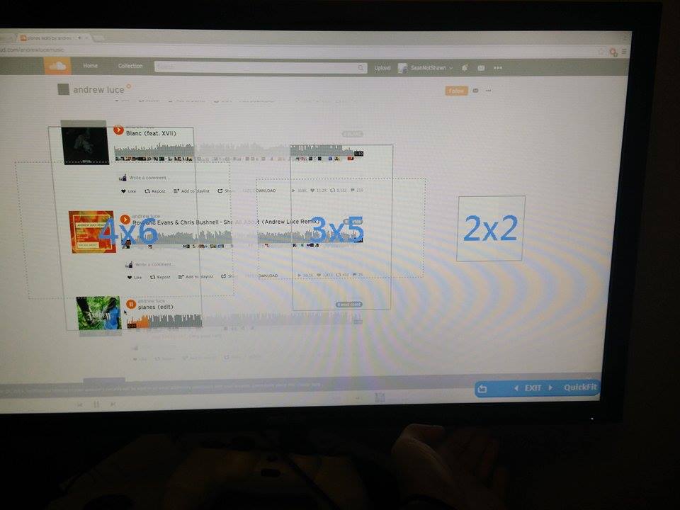
- The left 2 icons, in my opinion, are not common and users will not understand their functionality until they press it. Having icons provide a simple design, but if it is not easy to understand what the icons are, it be difficult for users to learn the interface. Til this day, I still have no idea what the left button does. The picture on the right shows what is shown on the screen when I press the button. I have no idea what the purpose of this functionality is. If help is needed, there is probably a user manual for this TV, but no one ever looks at the user manual.
 |  |
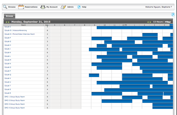
2. Northeastern's site to Reserve Library Study Room
- I think this website to reserve library rooms is a great example of a bad UI design. The purpose of this site is to allow users to reserve study rooms at the library. Looking at this page, you would think that if you click on an empty time slot for a room, it would allow you to book the room during that time. However, it will not do that. There is no feedback when a slot is clicked on. I guess the purpose of this page is used to strictly view all the rooms and to show the times it is available or when it is not available. There is a separate page that you would need to go to book the room. I think it is very inefficient to have to go to a different page to view the availability of the rooms and remember the exact times and the room name the user would like to book. This uses up the user's memory. Also, in the screen shot shown, I am able to view time sloths from 5am - 4pm. In order to view the times past 4pm, you need to click on the green arrow on the top left. However, once that arrow is clicked, you can only view time slots 5pm - 4am the next day. I don't see the logic in this. I think this is a bit annoying, not efficient, and provides poor visibility. Users should be able to easily view all the time slots for one day. I think this area could be improved with a horizontal scroll bar. That way users can continuously scroll to any time slot for any given day. The arrow should be used to view the next day.
 RSS Feed
